Working closely with the team at Oyster, we delivered a clean, contemporary logo based on the established brand typeface, Avenir.
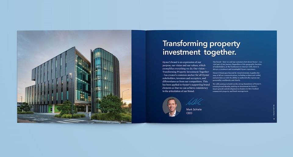
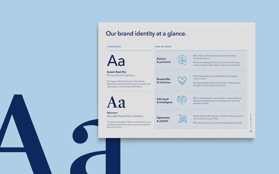
The brand voice typeface Mercury was chosen for its mature, confident and conversational tone.
At Streamline creative, we were briefed with modernising Oyster Property Group’s logo and visual identity.
Working closely with the team at Oyster, we delivered a clean, contemporary logo based on the established brand typeface, Avenir.
The brand voice typeface Mercury was chosen for its mature, confident and conversational tone.